Game Accessibility Statement
From the outset Saltsea Chronicles has been designed to be accessible to as many players possible, given the resources we had available. We know that there’s much more we could still do, and we continue to want to improve our efforts in this area (within the budgetary restrictions of an Indie Studio).
One of our goals during development was to make sure that players with various individual needs were able to enjoy the game without encountering barriers to their experience - and we also wanted to introduce those features and design decisions here so you can make an empowered decision about whether the game will be an accessible experience for you.
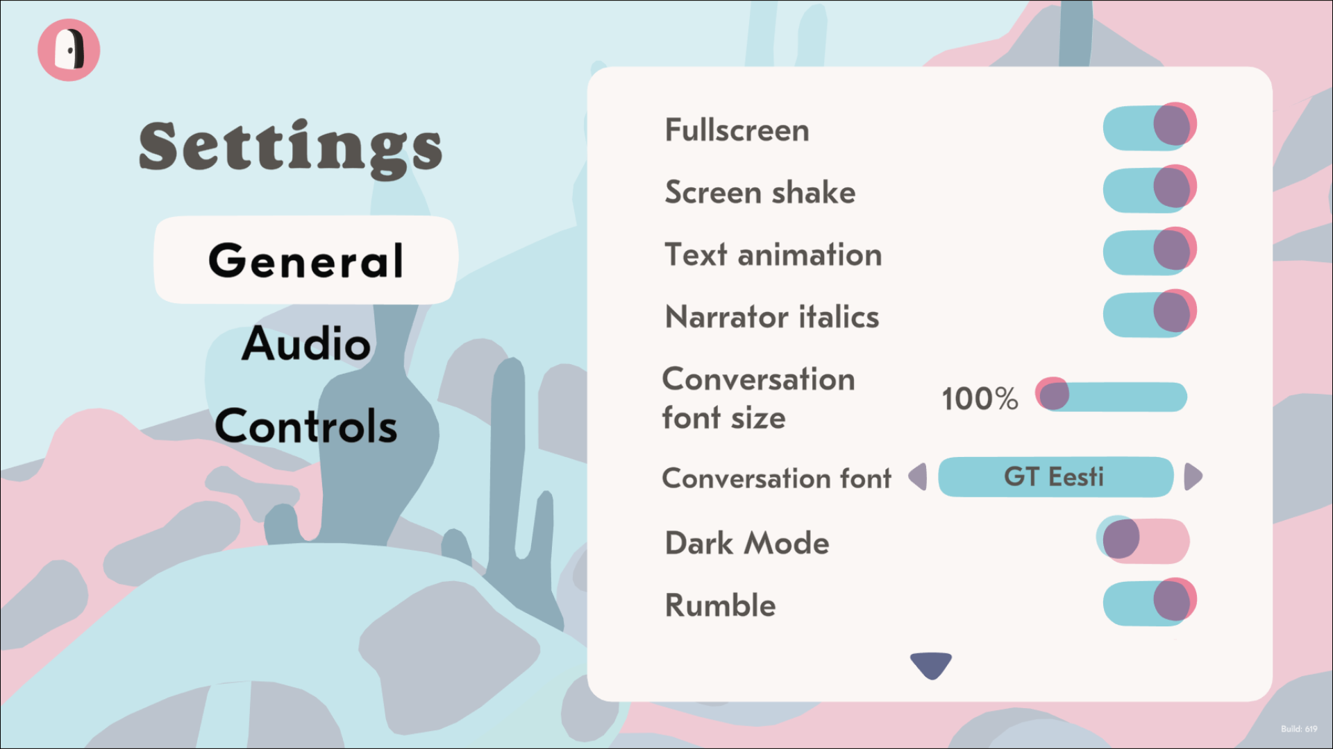
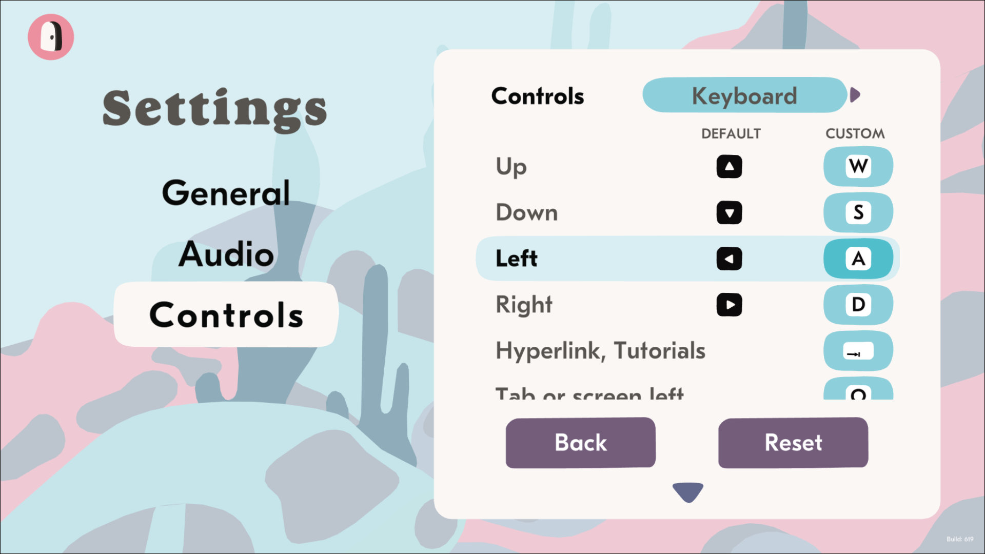
We focussed on needs relating to visual, auditory, cognitive and mobility issues, and many of our decisions relating to the design of the default UI and navigation of the game were made in order to provide the most accommodations with this in mind. There are additional Settings you can use to alter your experience, but our UI design, font choices, and colour choices has always centred these needs too. Below you will see screenshots of the Settings menu, where we’ve built in a set of toggleable options, so that players can further customise the experience to their needs.
We can’t guarantee we’ll be able to continue to work on the game long after launch, but if the game is successful enough to underwrite further work we also pledge to channel funds in to add additional accessibility features as well as DLC.
Here is a summary of the some of the key accessibility features included in the Settings for the game:
Adjustable text size
Togglable font for Dyslexia
Dark Mode colour scheme
Toggleable visual effects on text
Toggleable text indenting
Remappable controls for all platforms
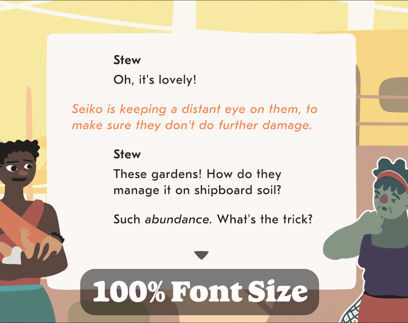
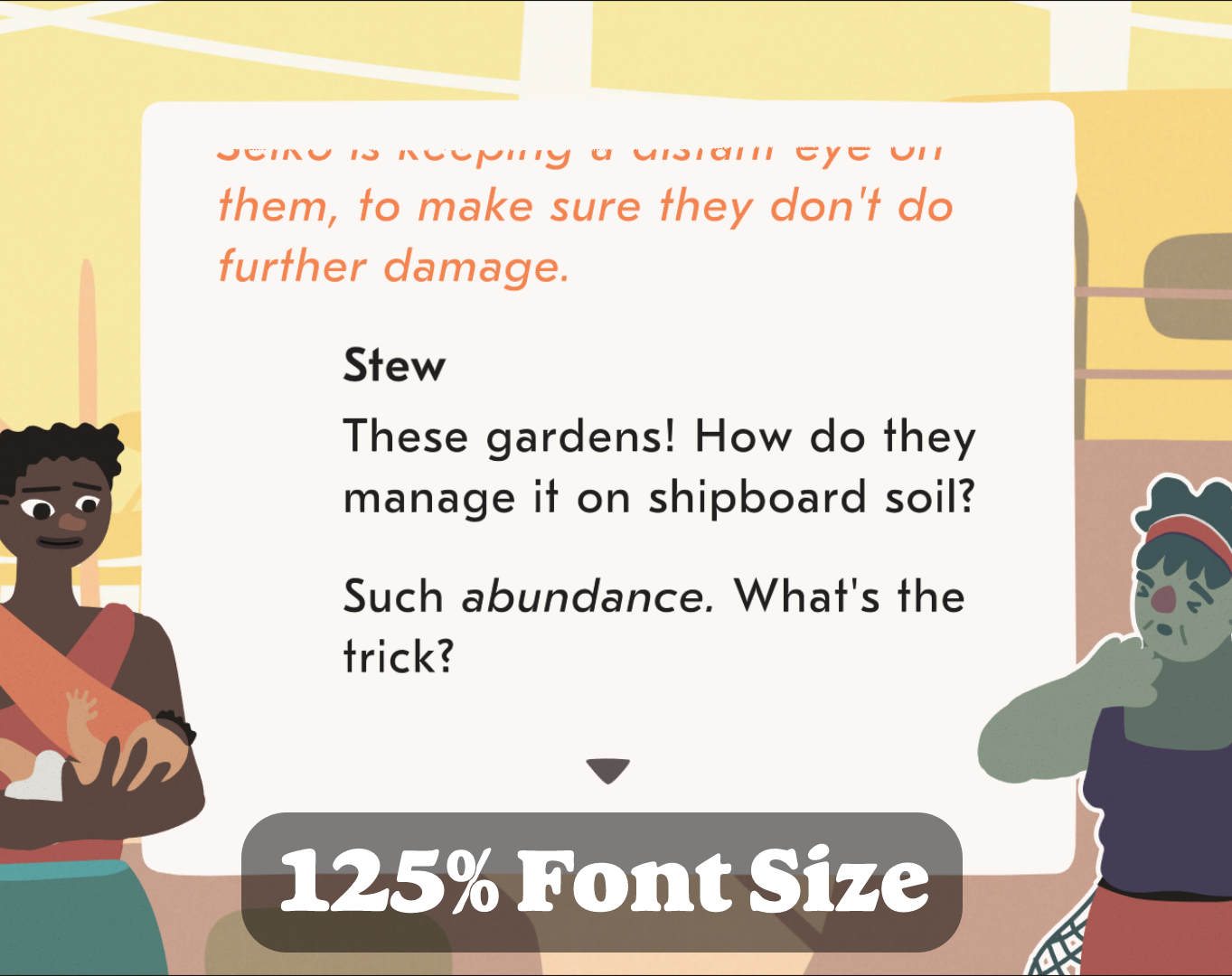
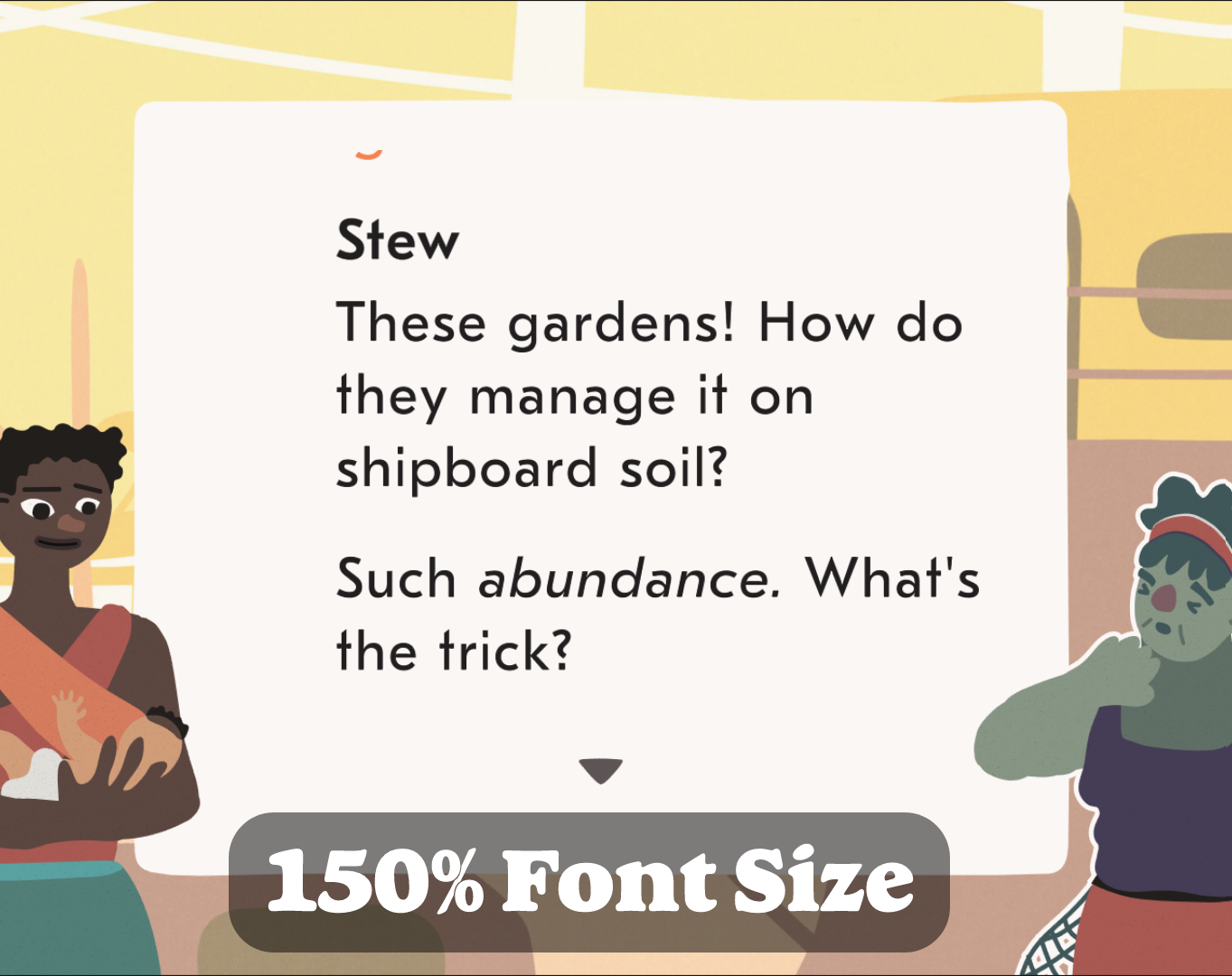
Adjustable Font Size
Players can freely tweak the size of the conversation text to provide a more comfortable reading experience. We also designed the UI so that we could make the font as large as possible as default.
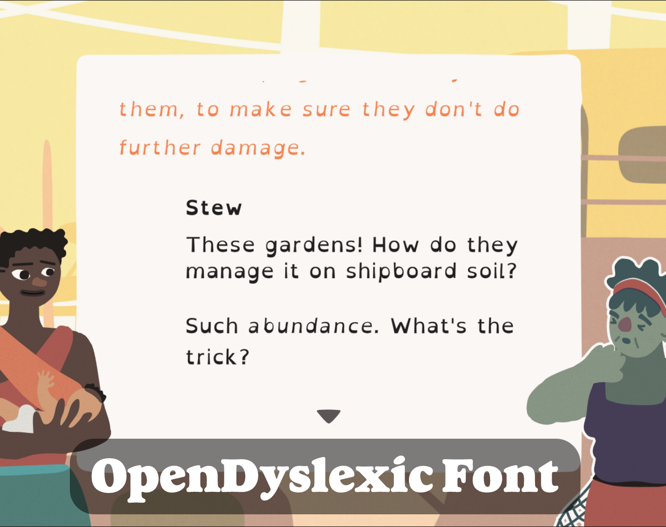
Dyslexia Font
Additionally, players can switch out the default typeface for OpenDyslexic — a typeface designed specifically to aid the reading experience for people with Dyslexia. We read many studies on the features that make fonts accessible to the most folks and this also guided the choice of our default font, but if you prefer OpenDyslexic, the option is there for you too.
Remappable Controls
To better accommodate players who find the default button placement uncomfortable, and to provide some support for specialist accessibility controllers, the game supports remapping of all inputs. This functionality extends to gamepad controller schemes as well as the keyboard.
Toggleable Effects
By default, the game features screen shake, text animations, controller rumble and sections of italic text. However, for those for whom these would make reading more challenging - all of these presentational elements are separately toggleable within the Settings menu.
Dark Mode
Dark mode switches the colour palette of the main conversation UI, for players who prefer reading against a dark background.
The design teams at the heart of this game have constantly tried to stay abreast of best practices, and worked with Accessibility Consultants to make sure that the game is - within our resources - as accessible as possible. We acknowledge that this is a continuing process however, and are always trying to improve and learn. While our ability to continue to work on the game after launch will be limited by its relative success - if you would like to share thoughts on how our design could be more accessible please feel free to reach out to us on our Contact page. If we can’t incorporate it into this game, we will do our best to build it into our design guidelines for the next. Thank you.
